What is Flat UI Design?
Advocates of flat design seek simplicity by replacing visual details and extra cues with essentials. 3D features such as bevelled edges, shadows, gradients and reflections long employed by mainstream designers have been discarded by those who practice flat design. With today’s smaller display areas found on tablets and smartphones, the need for flat design is evident.
 In web design, flat pages seldom display dimensional features or textures. Parallax scrolling and visual clarity drive appearance.
Google Now epitomizes flat design excellence. With a card-like system, information is bracketed. Data displays on a standard-sized card to facilitate reading and swiping. Windows 8 is another example. As a spinoff of Microsoft’s Metro design language, information delivery or typography is valued over graphic design to create content that’s more explicitly understandable.
Design Modo describes flat design as a methodology that does not require any extra effects or include any three-dimensional attributes. Gone are drop shadows, gradients, embossing, bevels or other tools that lift elements off the screen or create depth. Icons and UI elements are crisp and lack extraneous embellishments such as shadows.
Leaving Skeuomorphic Design Behind
This design incorporates the emulation of natural materials as a mechanism for composition. Examples are wood, felt, fire, metal, glass, water, clouds and velvet. Skeuomorphic design can be used as background or texture.
TechCrunch recalls how Apple made fun of their own Skeuomorphic design. Many jokes have been made about skeumorphism, but undoubtedly it will continue to be popular in some circles. Apple’s official shift from skeuomorphism to a more simplified design was considered to be the death knell of skeuomorphism at the end of 2012.
Implementation techniques
Dre.io describes card design. Card ui is not totally flat but it’s very easy on the eyes and clean looking. Usually content is separated in “blocks,” typically in 2 to 3 column layouts. Google, Pinterest, and Mashable do this well. Dre I/O was based on Google’s card UI.
The-webdesign.net remarks on retro colors for the internet as a new trend. If you have already taken a closer look at some of the newer UIs, you will have noticed that the same retro colors always appear. These alternate-looking color combinations are typical for icons, buttons, glyphs and graphics and create a fresh and modern look that has been recycled from a bygone era. Mustard, blue and salmon is an example of one popular color scheme.
Software tools for Flat UI
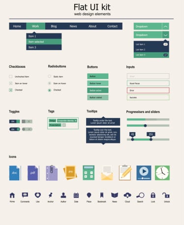
User interface kits are helpful for initiating flat design projects. Many familiar flat UI design elements are buttons, menus, input areas, slidebars, navigation bars, share zones, tooltips, textboxes, colors icons and glyphs. DesignModo offers tools for Flat UI design and integrates with Photoshop.
However, you don’t actually need a Flat UI tool to do Flat UI development. Focus on the concept of being in a single plane. You can create with any UI tools you please. Just leave behind the effects and cut to the essentials.
Companies using Flat UI
Apple, Microsoft, Google, XBOX and Bing are just a few of the many companies now embracing flat design. Fastcodesign.com will show you their simply slick and trendy UI techniques. Windows 8 has gone totally flat and iOS 7 seems to have followed suit. Touch screens belie 3d fake texture. 2-D interfaces appear more wholesome. The rediscovery of white space, typography and a clean authentic look makes excellent design sense.
If you’re interested in freelance graphic design projects and self employment advice, contact us today to learn more.
