Are you losing money on email? Nearly half of all emails are opened on mobile devices. Which means if you’re not specifically optimizing your email campaign for mobile devices, you could be losing money.
Not to worry–it’s an easy problem to fix. Here are the three most important areas to watch out for when it comes to mobile email marketing.
 Are Slow-Loading Emails Killing Your Conversions?
A recent marketing study showed that even a one-second delay, on average, caused conversions to decrease by 7%! What causes this kind of delay? More importantly, how can you make sure your own emails load as quickly as possible?
Email images are the #1 culprit when it comes to mobile emails that don’t load quickly enough. So it’s easy enough to just take images out of your emails–right? It’s not that simple. But there is a simple solution.
Emails with compelling images average 94% more views – almost twice as many – as those without, in most verticals. Most marketers find that the best way to keep images while still reducing load time is simply to make the images smaller.
This doesn’t necessarily mean you should make your images appear smaller. (That’s actually a separate issue we’ll tackle below). You simply want to reduce the data size each image takes up – preferably from megabytes to kilobytes.
You don’t have to worry about sacrificing quality, either. Most images can be reduced in file size 80% before they show a noticeable drop in quality.
In short, make sure your emails include images, and make sure they load fast!
Make Sure Your Links and Buttons Are Easily Clickable
It just won’t do if people have trouble clicking them. You’ll loose a lot of conversions that way.
There’s no sense in making it difficult for readers to click your links. You lose money every time consumers have problems clicking! Instead, turn your clickable icons and other links into easy targets for your readers.
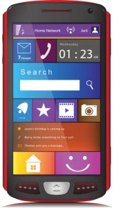
How? Make them the right size. An MIT study on the mechanics of the tactile sense revealed that adult fingers come as big as 57 pixels wide. That’s a size that will easily appear on the smallest smartphone screen.
Following the advice in the previous section, you’ll be coding (or having someone else code) your emails for screen percentage instead of pixel size. How do accomplish the one while focusing on the other?
The best rule of thumb here is to make sure your images show up at least 20% of screen width. This makes it big enough to show up at slightly over 57 pixels for the iPhone, which typically has a more narrow screen than Android phones and other devices.
To simplify matters further, just set your image height to “Auto.” That way, your images will be the same no matter how long a device is in proportion to its width.
Responsive Email Design is Just as Important as Responsive Web Design
Clickable or attention-getting images can be a real deal-breaker or deal-maker when it comes to mobile email marketing. But they are only one part of the equation. Textual formatting, subheaders, and any borders or other visual formatting you may use, all need to adjust to be smooth whether they appear on an iPhone, a Nexus Seven, or a Windows Surface Pro.
Responsive design for email is becoming just as important as responsive Web design. If you’re not a coder, don’t worry–that’s something that experienced mobile developers can fix.
More importantly, a creative staffing service can supply you with the expertise you need, when you need it, without your having to hire full-time or part-time employees. You don’t even have to take care of the outsourcing yourself! Contact us today to learn more.
