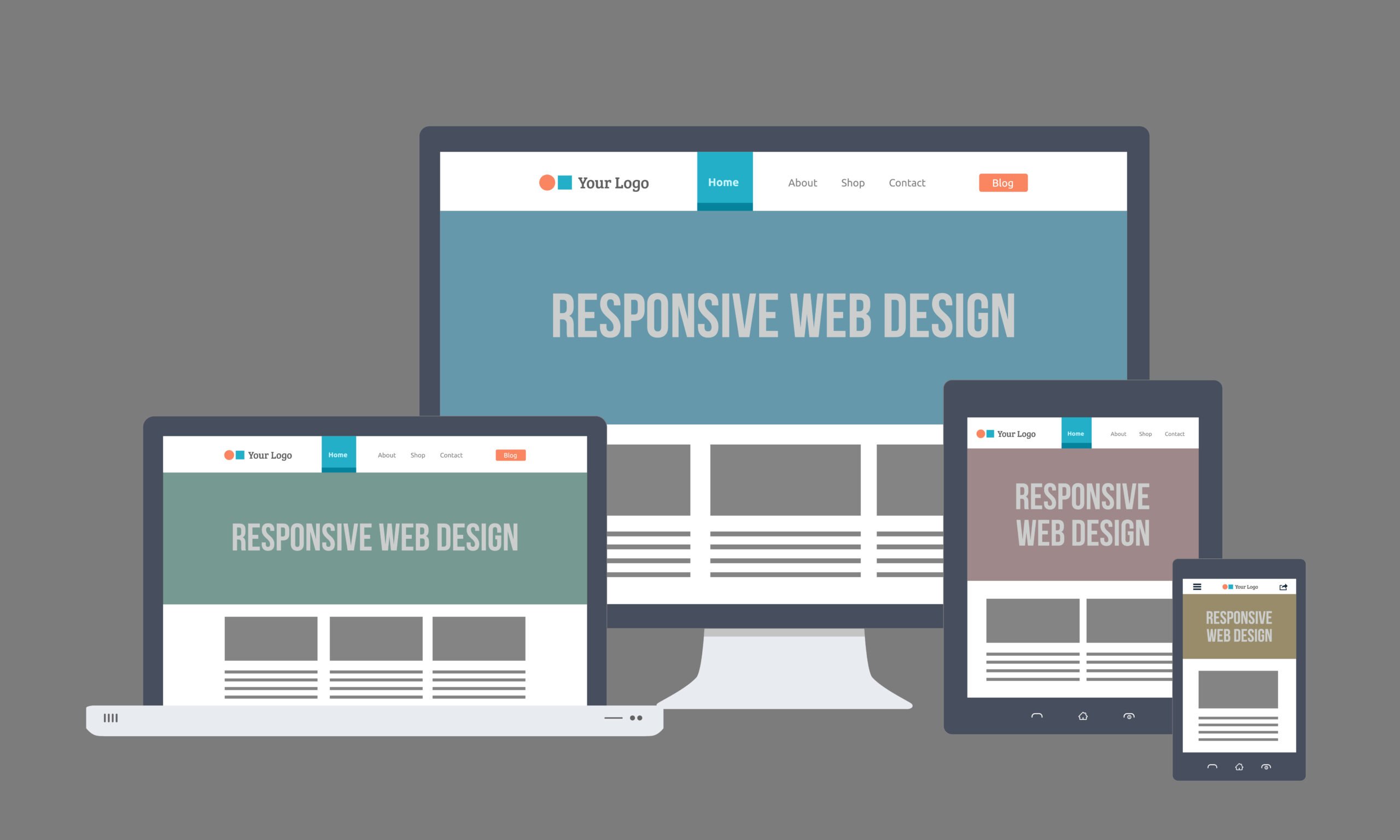
Have you embraced Responsive Web Design yet? Responsive web design, or RWD, resolves many of the problems associated with today’s multi-device Internet viewing experience while streamlining the content creation process. RWD uses customized CSS implementations based on the dimensions of your web browser window’s dimensions instead of predetermined static sizes. This means developers can do things like stack content underneath other content and adjust column widths to fit for smaller screens. Web designers and web programmers should embrace RWD because it eliminates the need to develop different websites for desktop, tablet, and mobile devices. The singular site means that end-users like content creators and CMS editors only need to worry about building pages once instead of two or three times to support all devices. RWD makes it so you experience the same web content on a site regardless of device.
WAP vs. RWD
Just a few years ago it made sense to put the lion’s share of design into the desktop site while treating the WAP mobile site as more of a supplementary site. However, the older, primitive mobile sites are designed for older feature phones which bring a fraction of the processing power and graphical capabilities of a modern smartphone. Smartphones are capable of handling robust web experiences, the devices are just hindered by a smaller screen size. It also makes sense to focus your design efforts on the site that gets the most traffic, which until between 2013 and 2014 was the desktop site. Depending on the site, mobile traffic now constitutes half or more of all visits; however, the desktop sites still bring in large share of traffic so abandoning desktop in favor of mobile isn’t a viable option. If you’re running two or more sites, this means splitting your effort between separated desktop, tablet, and mobile sites which means more development time relative to how many people visit the site. RWD resolves problems with under-powered websites for mobile devices and eliminates needing to simultaneously develop multiple websites.
The Future of Web Design
While RWD is a great solution for the future of web design, there are a few caveats with the technique associated with using third-party content that’s not built for dynamic sizing on a responsive site. Designing the site itself is fairly straight forward as you can address errors with RWD display as they arise. However, when you’re working with content like advertisements and third-party widgets you may often find yourself trying to fit round pegs into square holes. The pegs can still fit in many cases with some creative zooming as well as post-loading CSS and JavaScript code adjustments. Third parties often bring content to your site through iframes, which can’t be style adjusted because of security issues. In problematic cases like static-sized iframe content, you may have to drop content or build pages that aren’t RWD compliant.
Get RWD Help
Have we convinced you it’s time to go for RWD? If you don’t already have someone on your team that is well versed in responsive web design, Contact us today to find the perfect well-versed designer.
Other Posts You Might Like:
Are you STILL Making These Web Design Mistakes?
3 Fantastic Items for Your Web Design Kit
Outdated Web Design Trends
